Project Detail: Logo Project of NYU's Visual Foundation Studio Course
Timeline: February 2018 - March 2018
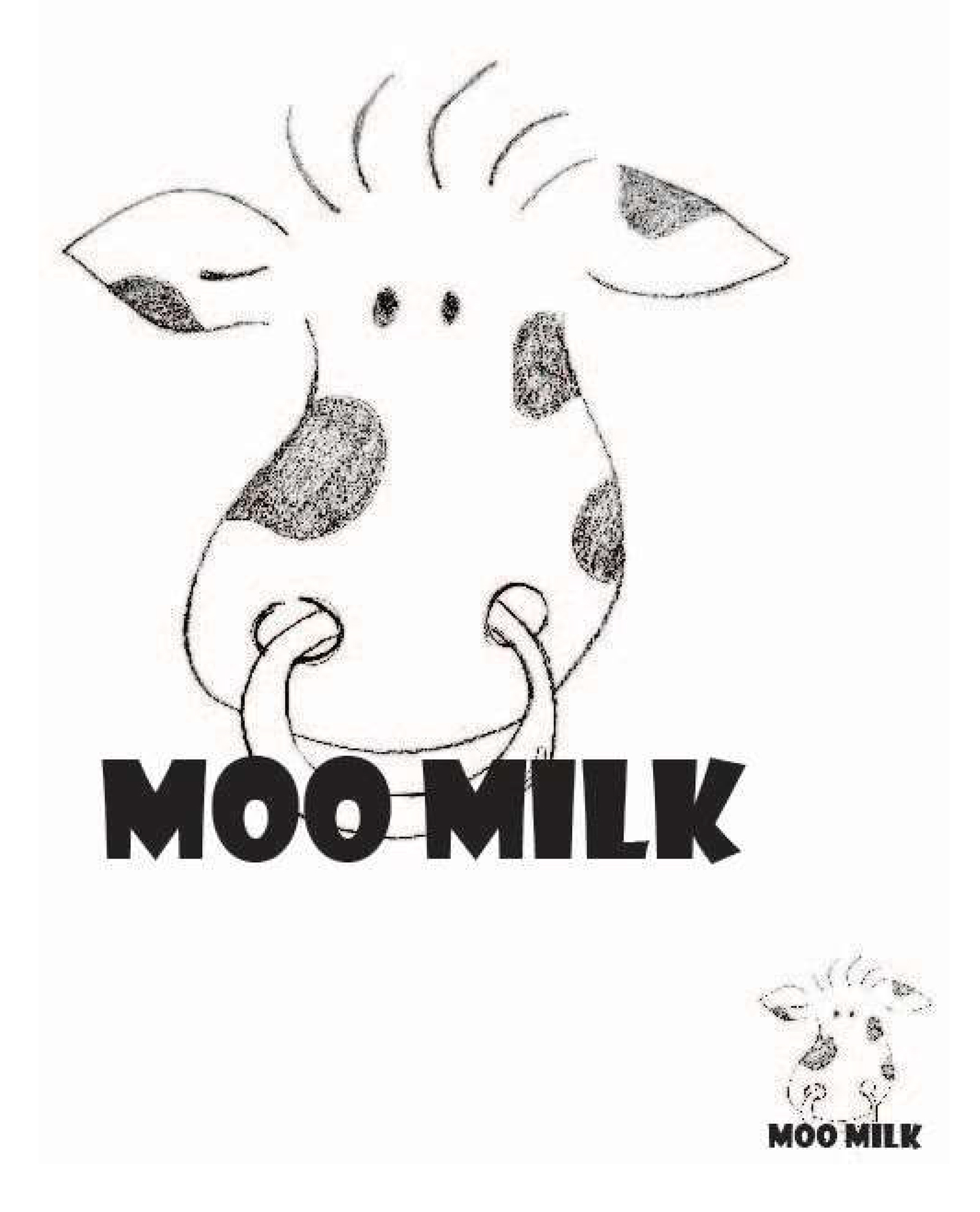
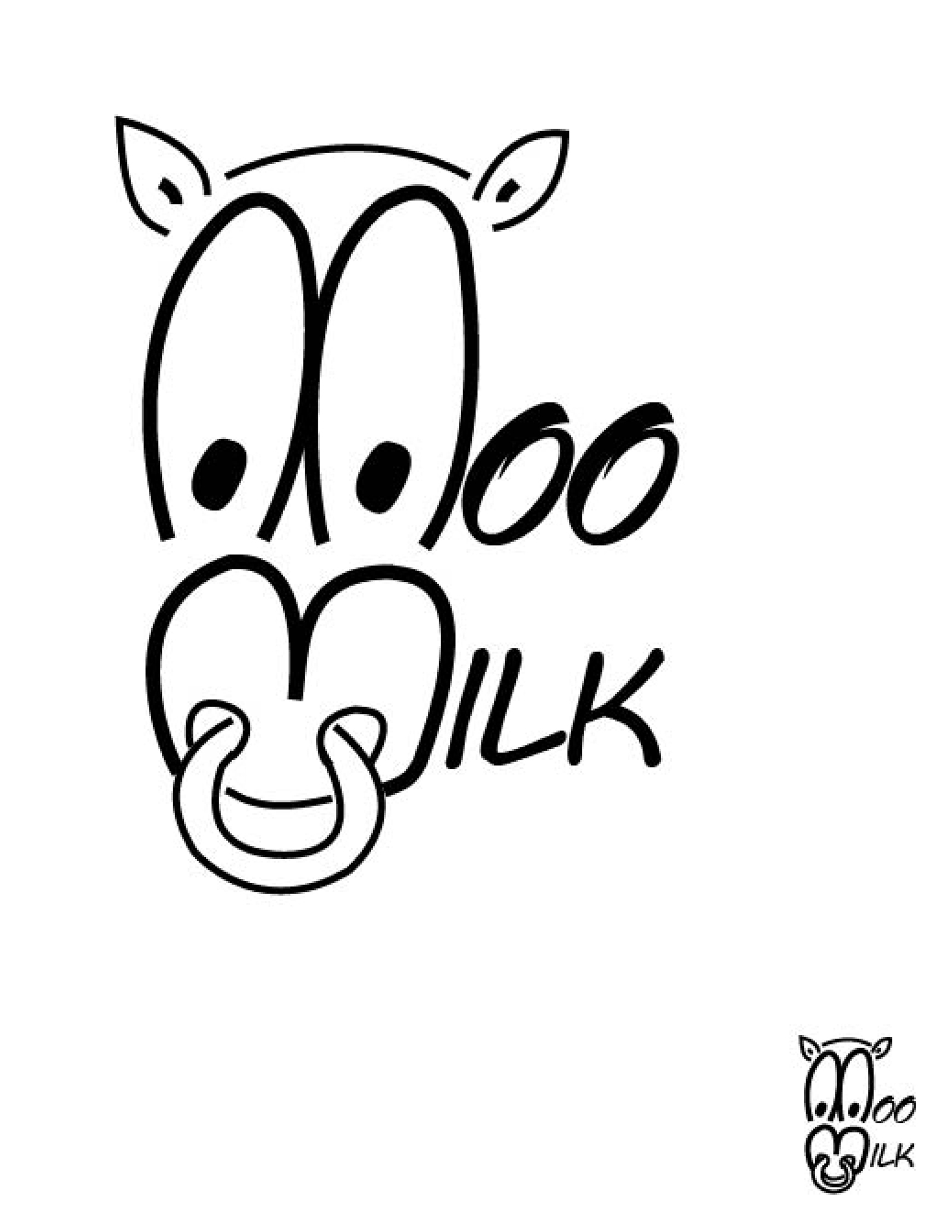
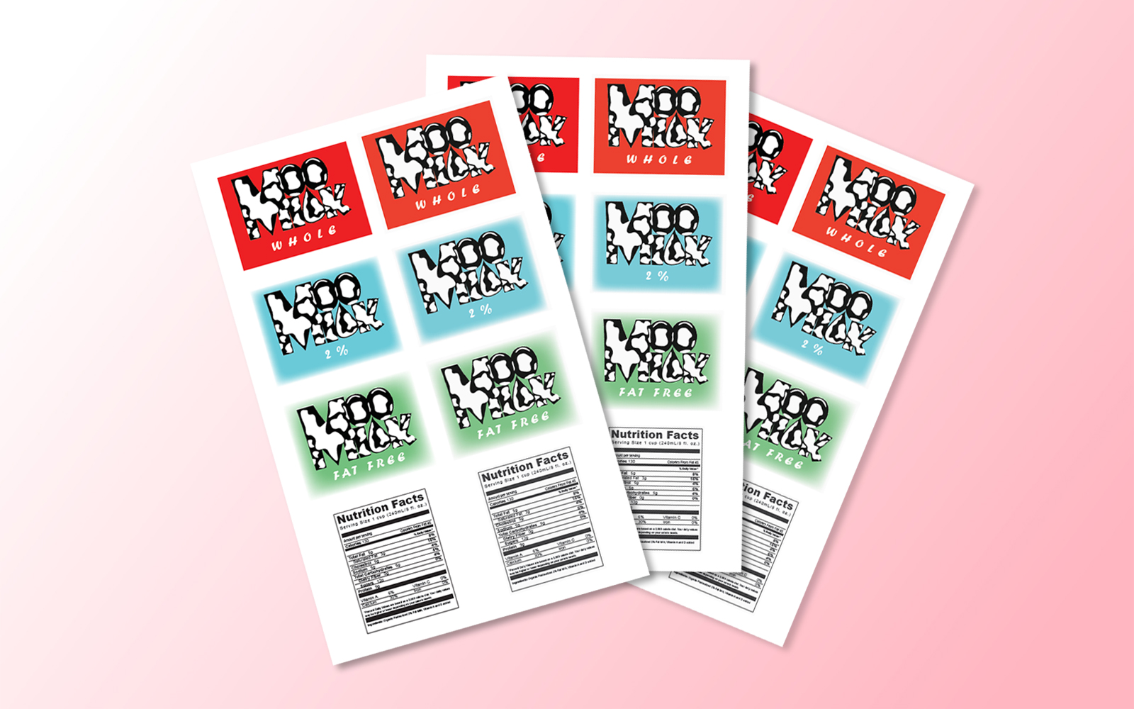
My first project of the Visual Foundation Studio course at NYU was to design a logo of choice. I decided to base my logo on a made-up milk company, Moo Milk, due to my love for the dairy product.
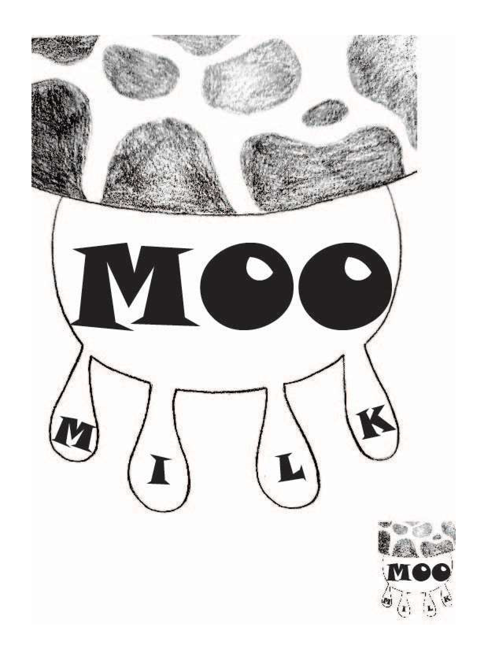
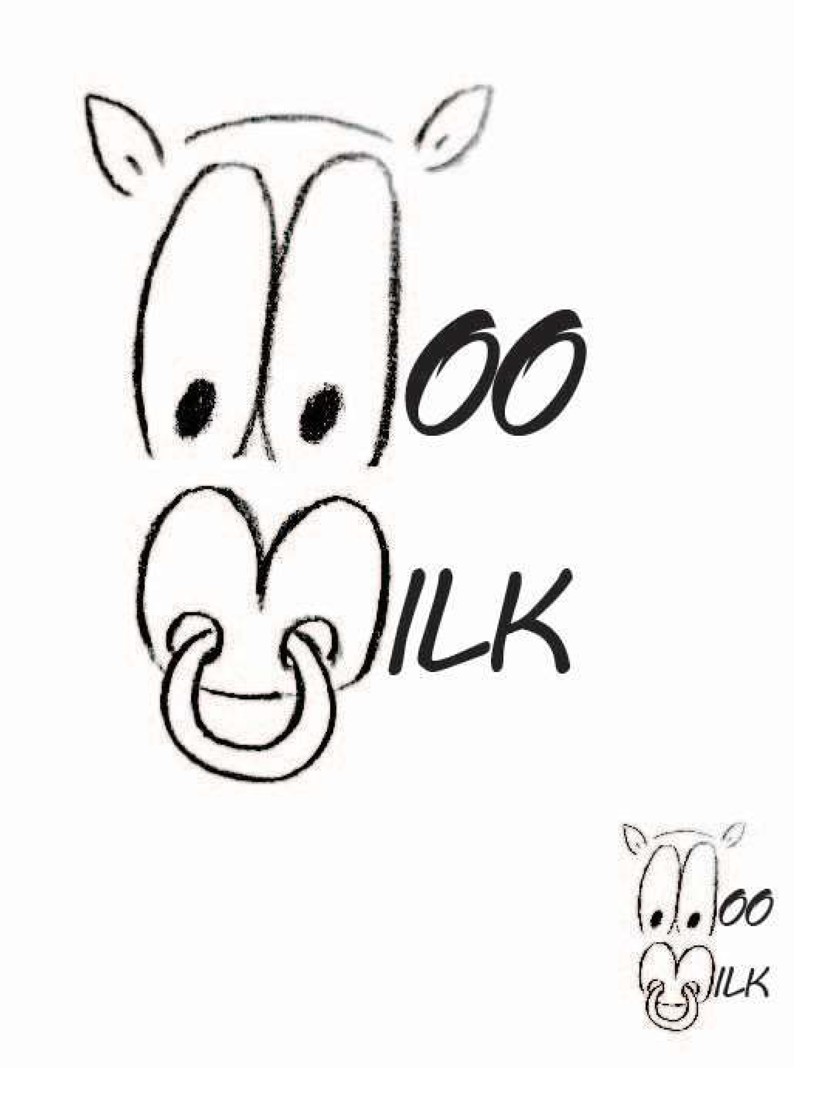
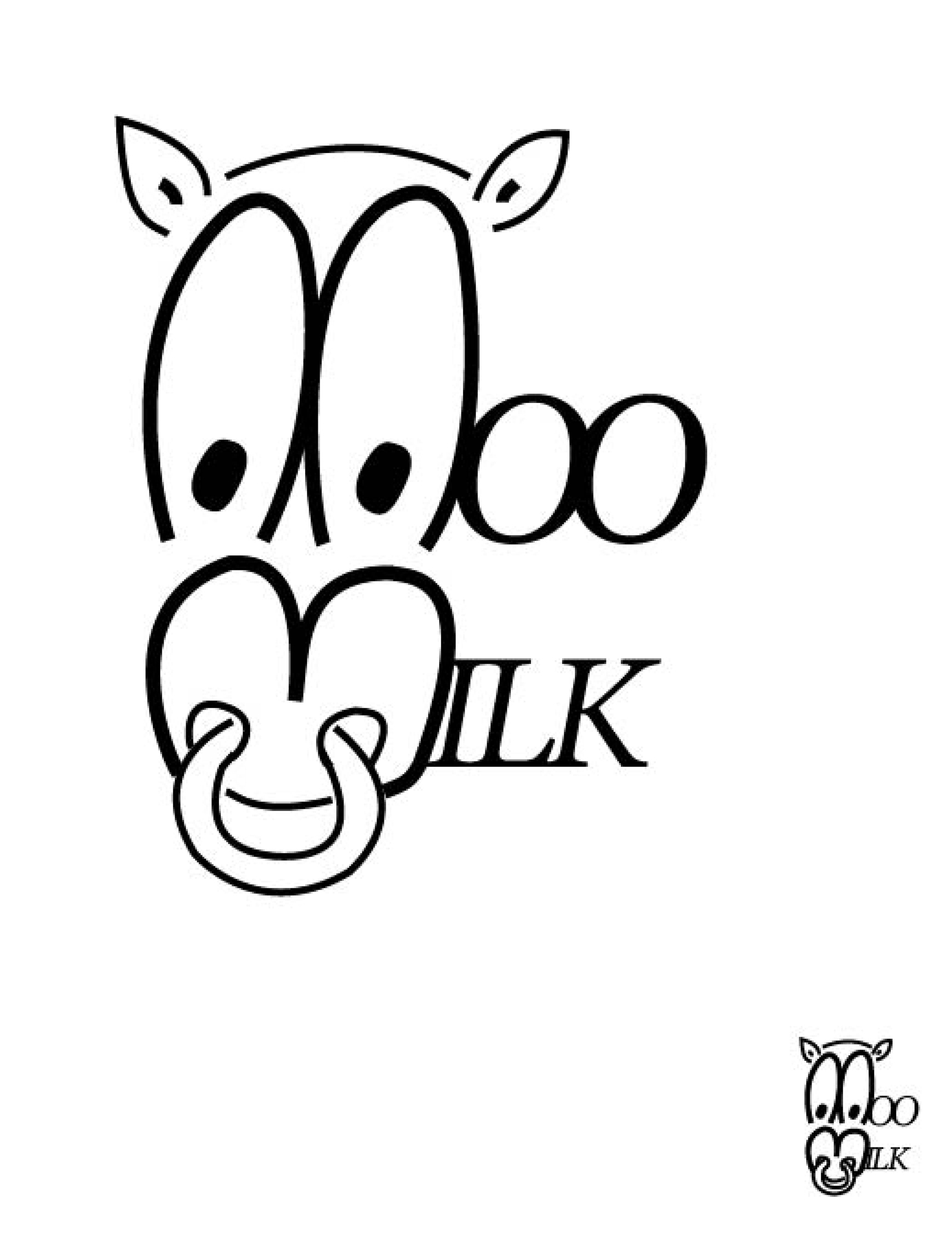
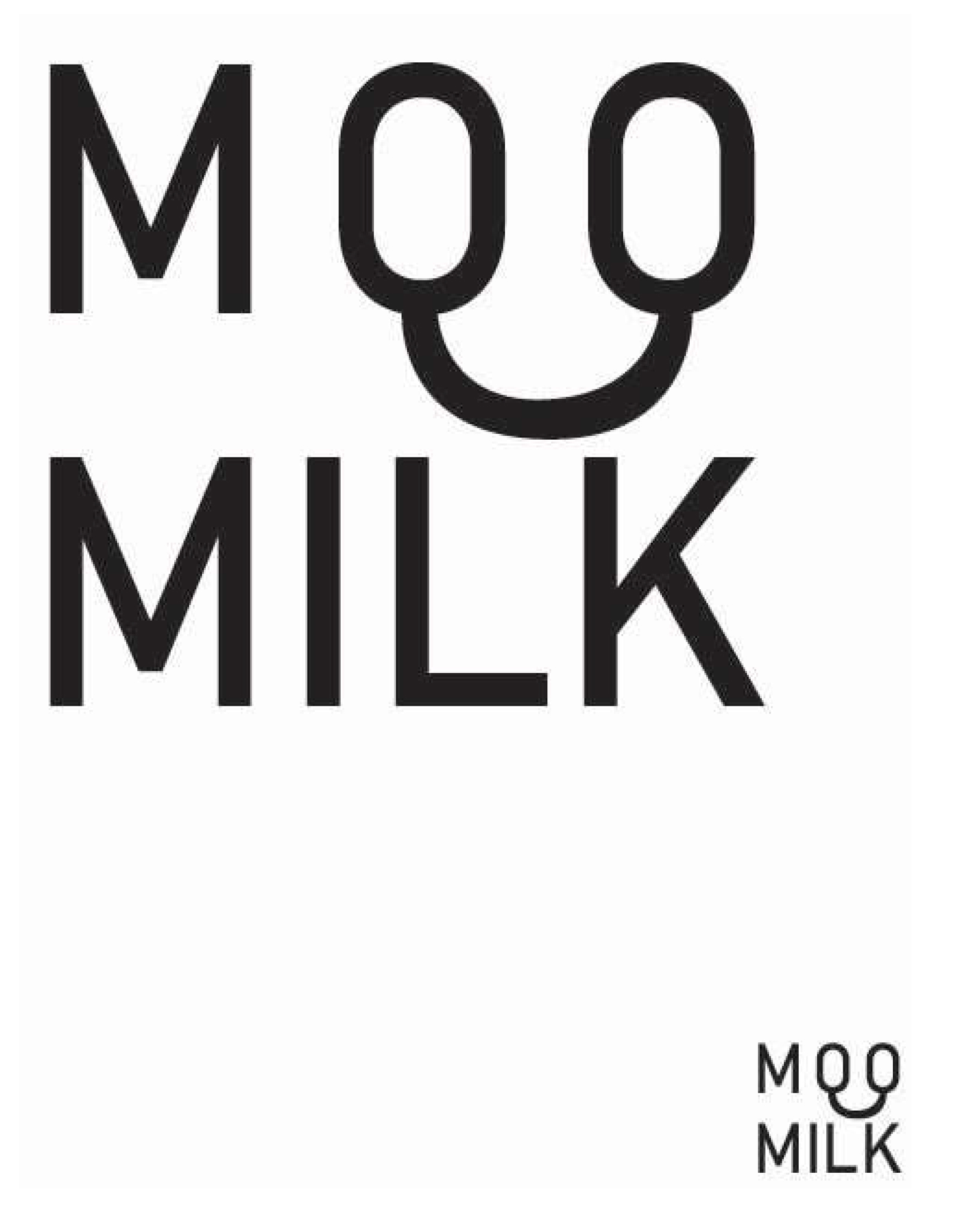
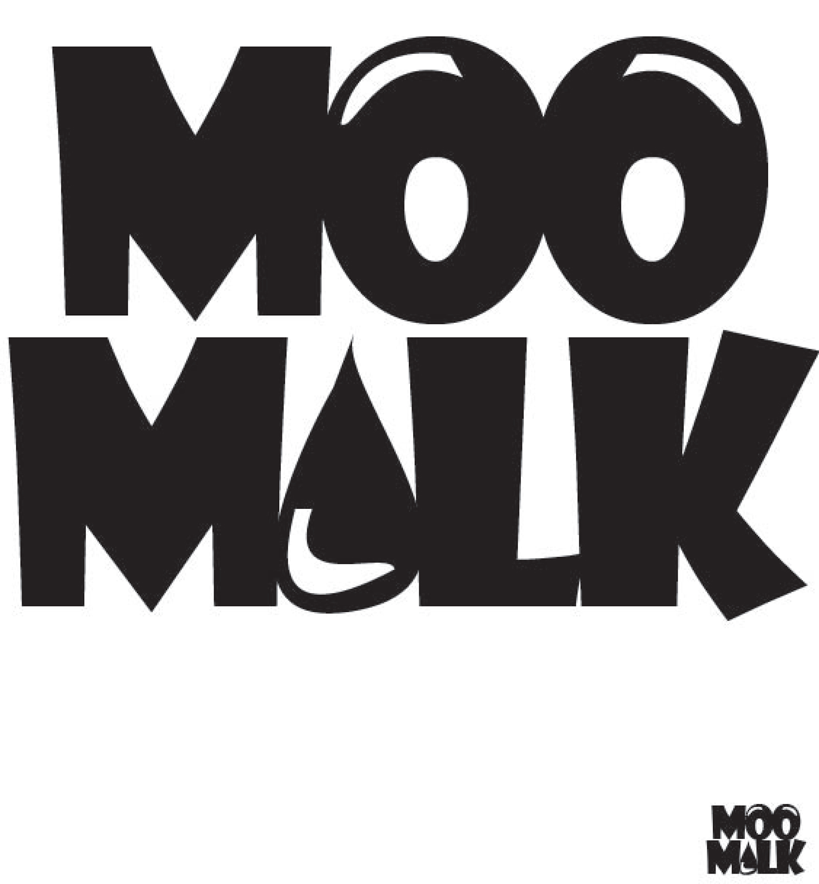
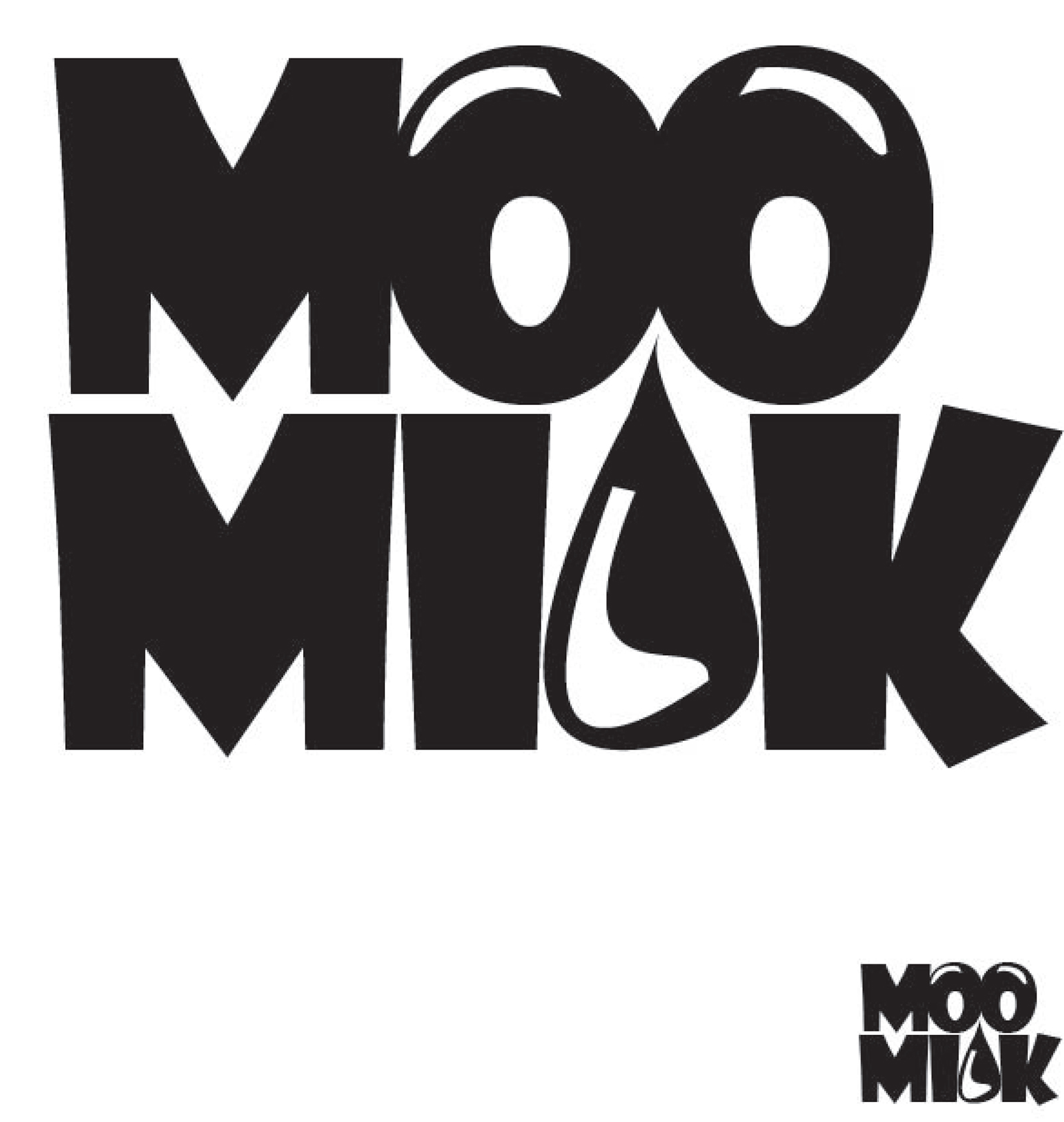
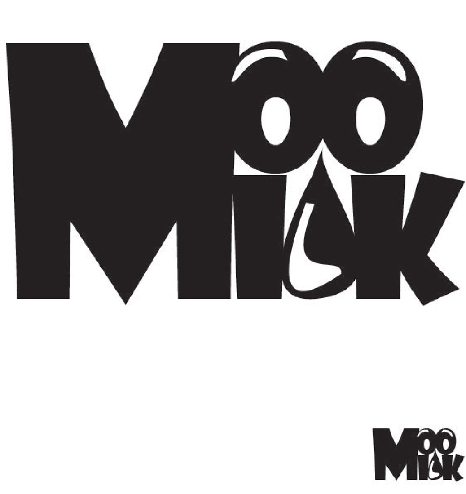
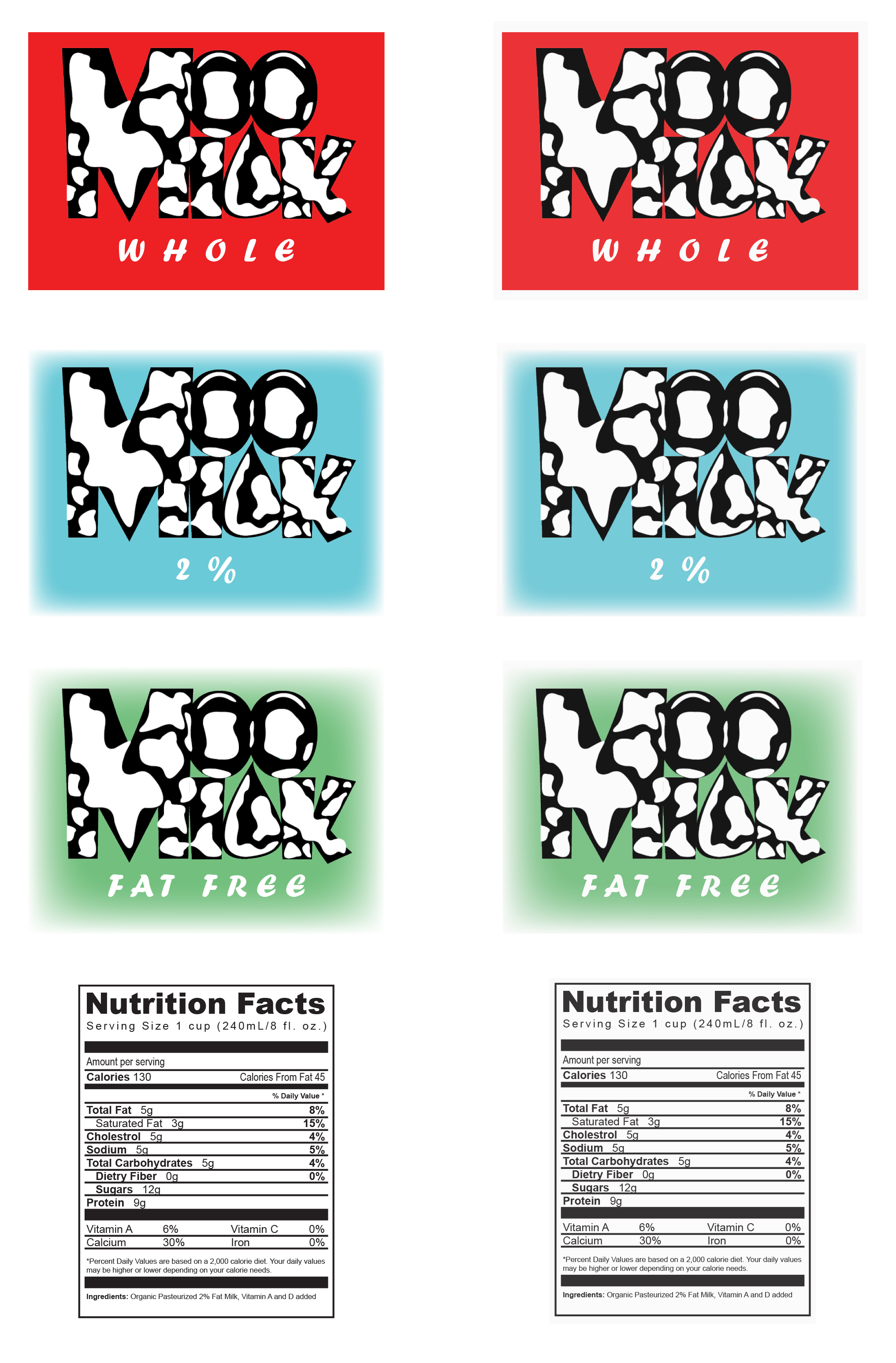
Key concepts used in this design include color and typography. I attempted to go for a more playful design to represent a milk company in hopes that the product would convey a lighthearted, welcoming mood. The final design has a typography base with white spots that I designed to represent a cow, with one spot representing the “L” in Moo Milk within a design that represents a drop of milk. The “O’s” and the drop of milk also form a vague face, adding on to the playful mood of the overall design.
This being my first creative project in college, I ran into many challenges as expected, the most memorable one being not knowing how to start. This is when I realized that as a creative, there is no such thing as a perfect start in design — or as some would say, the concept of a perfect design itself is a myth. I learned that designing is not simply drawing a visualized idea on paper but rather a journey requiring patience, dedication, and motivation. As a student mentally blocked by the meaningless search for the perfect start, every step forwards was followed by two steps backwards as I drifted farther away from the goal that I couldn’t even clearly see.
So how did I overcome this feeling of aimlessness?
I cleared my mind and casted away my perfectionist ideals to allow my hand to move freely as it drew, drew, and drew.
TECHNICAL SKILLS
Graphic Design
Iterating
PERSONAL SKILLS
Attention to Detail
Creativity
Problem Solving
TOOLS USED
Adobe Illustrator
Adobe InDesign
Adobe Photoshop
FINAL DESIGN
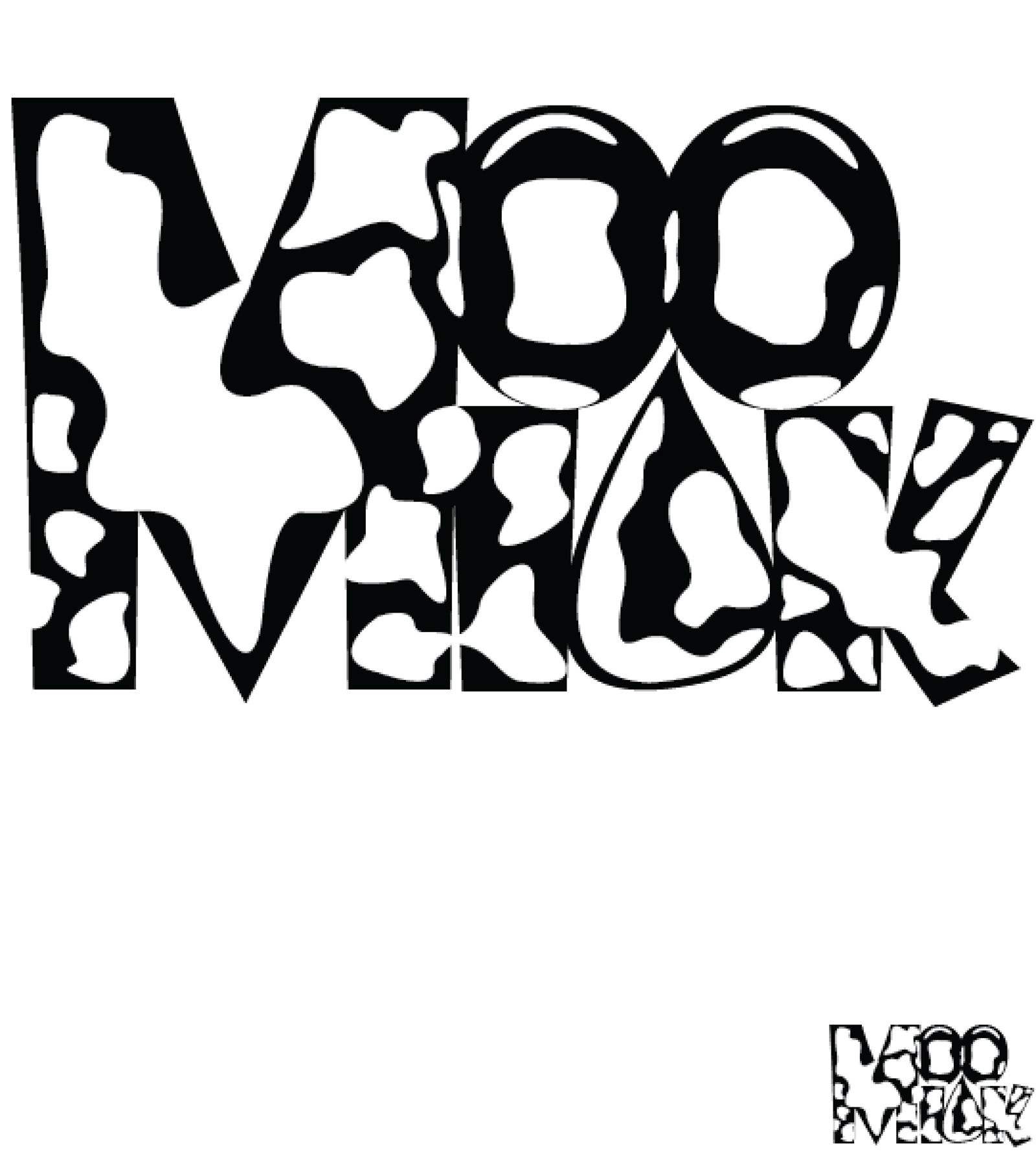
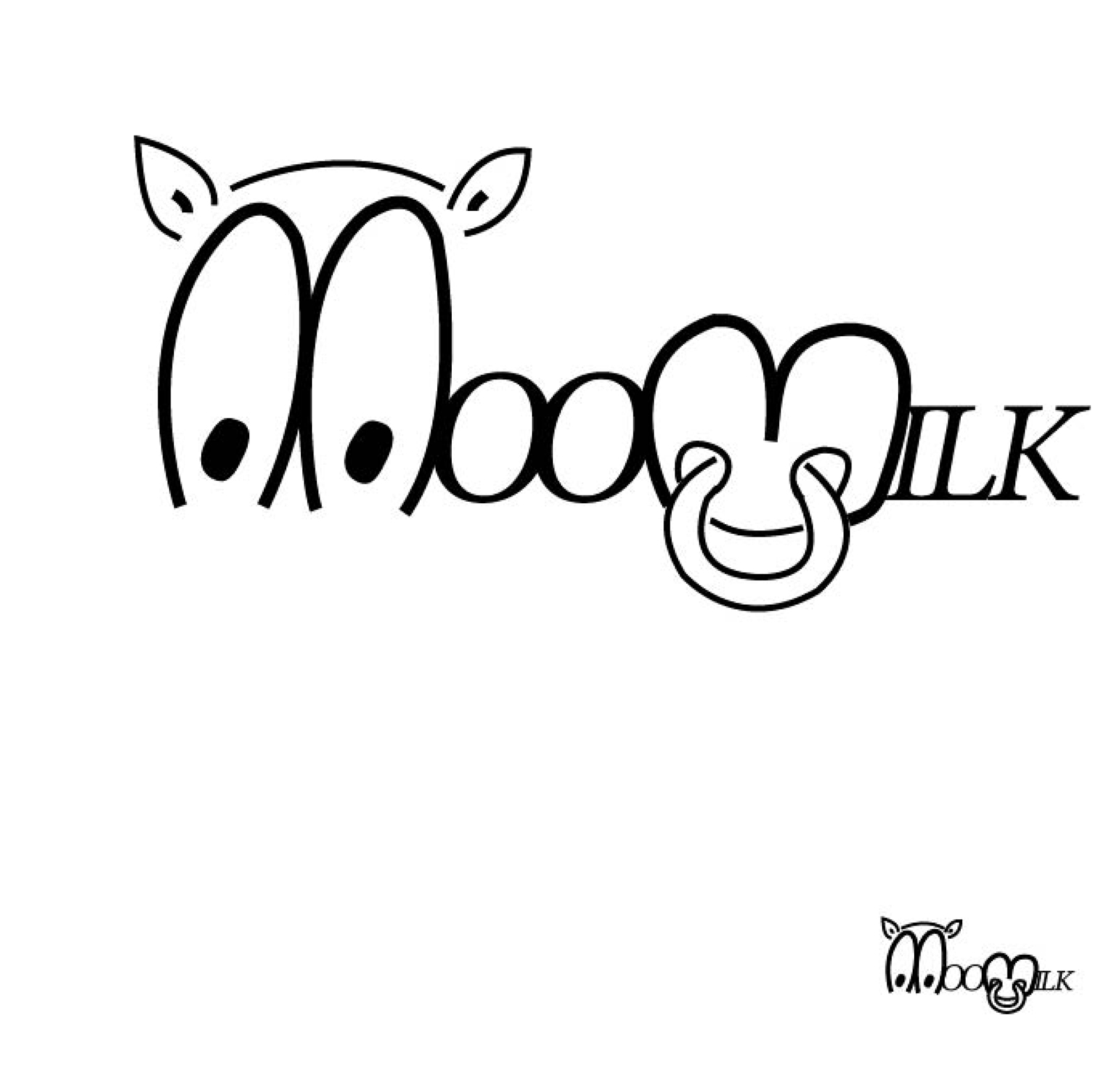
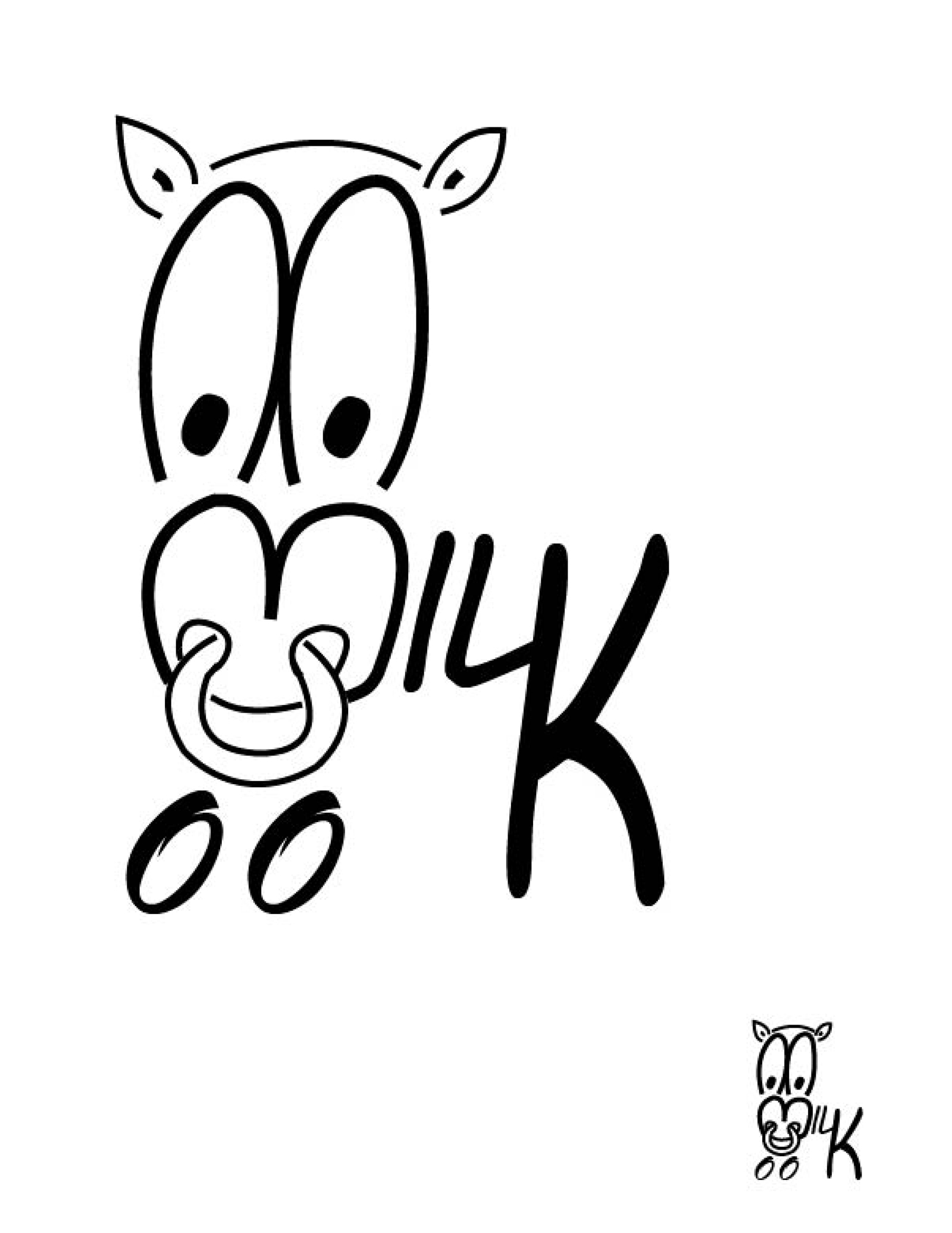
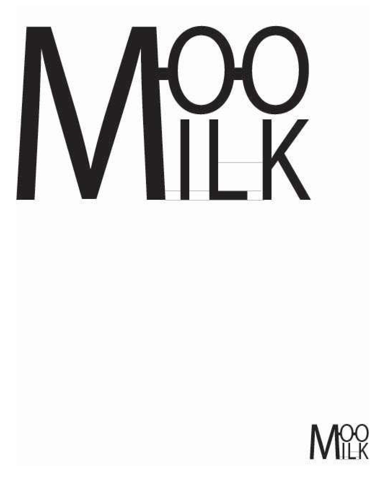
DESIGN PROCESS